Gantt chart. Part 4
Contents
- Gantt chart with D3
- Gantt chart with D3. Part 2
- Gantt chart with Canvas
- Gantt chart with CSS Grids (you are here)
Seems like every two years or so I hop on my Gantt chart implementation and rework it completely.
Last few attempts (rev. 1, rev. 2, rev. 3) were alright, but I was never quite satisfied with the implementation - be it SVG, which has a toll on a browser and has quite limited customization functionality or Canvas API, with same limited customization but being fast.
With the recent introduction of grid layouts in CSS, now supported in all browsers, now seems like a perfect time to revisit the old implementations once again:
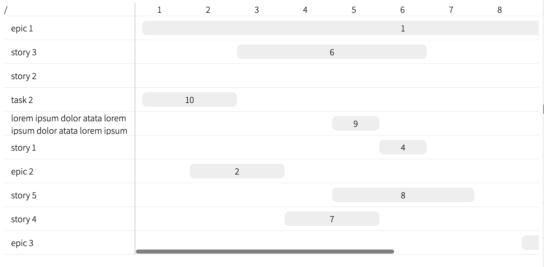
This revision now has a proper horizontal scrolling on the panel with bars - meaning the labels on the left panel stay in place whilst the left panel is scrollable. Moreover, the chart is now relies on pure HTML and CSS (being rendered with React though), making it is possible to use rich markup inside the bars and labels.
Implementation steps
The data for the tests is going to look like this:
export const data = [
  {
    id: 1,
    name: "epic 1"
  },
  {
    id: 2,
    name: "epic 2"
  },
  {
    id: 3,
    name: "epic 3"
  },
  {
    id: 4,
    name: "story 1",
    parent: 1
  },
  {
    id: 5,
    name: "story 2",
    parent: 1
  },
  {
    id: 6,
    name: "story 3",
    parent: 1
  },
  {
    id: 7,
    name: "story 4",
    parent: 2
  },
  {
    id: 8,
    name: "story 5",
    parent: 2
  },
  {
    id: 9,
    name: "lorem ipsum dolor atata",
    parent: 5
  },
  {
    id: 10,
    name: "task 2",
    parent: 5
  }
];
The main component, <Gantt>, initially was implementated as follows:
import React, { useMemo } from "react";

import style from "./gantt.module.css";

const LeftPaneRow = ({ id, name }) => {
  return <div className={style.row}>{name}</div>;
};

const LeftPane = ({ items }) => {
  return (
    <div className={style.left_pane}>
      <div className={style.left_pane_header}>/</div>

      <div className={style.left_pane_rows}>
        {items.map((item) => (
          <LeftPaneRow key={item.id} {...item} />
        ))}
      </div>
    </div>
  );
};

const RightPaneRow = ({ id, name }) => {
  return (
    <div className={style.row}>
      <div className={style.entry} style={{ left: 0 }}>
        {id}
      </div>
    </div>
  );
};

const RightPane = ({ items }) => {
  return (
    <div className={style.right_pane}>
      <div className={style.right_pane_header}>...scale...</div>
      <div className={style.right_pane_rows}>
        {items.map((item) => (
          <RightPaneRow key={item.id} {...item} />
        ))}
      </div>
    </div>
  );
};

export const flattenTree = (items) => {
  const queue = [];

  items.filter(({ parent }) => !parent).forEach((item) => queue.push(item));

  const result = [];
  const visited = new Set();

  while (queue.length > 0) {
    const item = queue.shift();

    if (visited.has(item.id)) {
      continue;
    }

    result.push(item);
    visited.add(item.id);

    items
      .filter((child) => child.parent === item.id)
      .forEach((child) => queue.unshift(child));
  }

  return result;
};

export const Gantt = ({ items }) => {
  const itemList = useMemo(() => flattenTree(items), [items]);

  return (
    <div className={style.gantt}>
      <LeftPane items={itemList} />
      <RightPane items={itemList} />
    </div>
  );
};
The core of the proper representation of this diagram is the CSS:
.gantt {
  display: grid;
  grid-template: 1fr / auto 1fr;
  grid-template-areas: "left right";
  width: 100%;
}

.gantt .left_pane {
  display: grid;
  grid-area: left;
  border-right: 1px solid #bbb;
  grid-template: auto 1fr / 1fr;
  grid-template-areas: "corner" "rows";
}

.gantt .left_pane .left_pane_rows {
  display: grid;
  grid-area: rows;
}

.gantt .left_pane .left_pane_header {
  display: grid;
  grid-area: corner;
}

.gantt .right_pane {
  display: grid;
  grid-template: auto 1fr / 1fr;
  grid-template-areas: "scale" "rows";
  grid-area: right;
  overflow: auto;
}

.gantt .right_pane .right_pane_rows {
  width: 10000px; /*temp*/
  display: grid;
  grid-area: rows;
}

.gantt .right_pane .right_pane_header {
  display: flex;
  grid-area: scale;
}

.gantt .row {
  height: 40px;
  align-items: center;
  display: flex;
}

.gantt .right_pane .row {
  position: relative;
}

.gantt .right_pane .row .entry {
  position: absolute;
  background: #eeeeee;
  padding: 0.1rem 0.5rem;
  border-radius: 0.4rem;
}
Good, we now have two panels with items aligned in rows and the right panel being scrollable if it gets really long.
Next thing, position: absolute is absolutely disgusting - we use grid layout already!
Instead, split each row into the same number of columns using grid and position the elements in there:
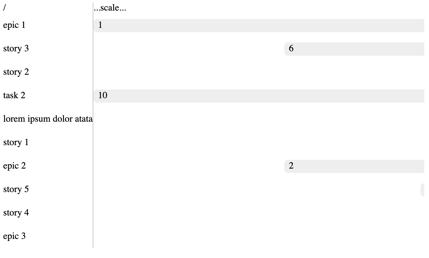
const RightPaneRow = ({ id, name, columns, start, end }) => {
  const gridTemplate = `auto / repeat(${columns}, 1fr)`;
  const gridArea = `1 / ${start} / 1 / ${end}`;

  return (
    <div
      className={style.row}
      style={{
        gridTemplate,
      }}
    >
      <div
        className={style.entry}
        style={{
          gridArea,
        }}
      >
        {id}
      </div>
    </div>
  );
};
and clean up the CSS a bit (like removing the position: absolute and reducing the width from 10000px down to 1000px):
.gantt .right_pane .right_pane_rows {
  width: 1000px; /*temp*/
  display: grid;
  grid-area: rows;
}

.gantt .row {
  height: 40px;
  align-items: center;
  display: grid;
}

.gantt .right_pane .row {
  position: relative;
}

.gantt .right_pane .row .entry {
  background: #eeeeee;
  padding: 0.1rem 0.5rem;
  border-radius: 0.4rem;
}
Now, let’s position the elements in each row using the column index:
const RightPanelRowEntry = ({ id, start, end, children }) => {
  const gridArea = `1 / ${start} / 1 / ${end}`;

  return (
    <div
      className={style.entry}
      style={{
        gridArea,
      }}
    >
      {children}
    </div>
  );
};

const RightPaneRow = ({ id, name, columns, start, end }) => {
  const gridTemplate = `auto / repeat(${columns}, 1fr)`;
  const gridArea = `1 / ${start} / 1 / ${end}`;

  return (
    <div
      className={style.row}
      style={{
        gridTemplate,
      }}
    >
      <div
        className={style.entry}
        style={{
          gridArea,
        }}
      >
        {id}
      </div>
    </div>
  );
};

const RightPaneHeaderRow = ({ columns, children }) => {
  const gridTemplate = `auto / repeat(${columns}, 1fr)`;

  return (
    <div
      className={style.right_pane_header_row}
      style={{
        gridTemplate,
      }}
    >
      {children}
    </div>
  );
};

const RightPaneHeader = ({ children }) => {
  return <div className={style.right_pane_header}>{children}</div>;
};

const RightPane = ({ items, columns }) => {
  const columnHeaders = [...Array(columns)].map((_, idx) => (
    <RightPaneHeader>{idx + 1}</RightPaneHeader>
  ));

  const rows = items.map((item) => (
    <RightPaneRow key={item.id} columns={columns}>
      <RightPanelRowEntry {...item}>{item.id}</RightPanelRowEntry>
    </RightPaneRow>
  ));

  return (
    <div className={style.right_pane}>
      <RightPaneHeaderRow columns={columns}>{columnHeaders}</RightPaneHeaderRow>
      <div className={style.right_pane_rows}>{rows}</div>
    </div>
  );
};
And add corresponding new CSS styles:
.gantt .right_pane .right_pane_header_row {
display: grid;
grid-area: scale;
}
.gantt .right_pane .right_pane_header_row .right_pane_header {
display: grid;
align-items: center;
text-align: center;
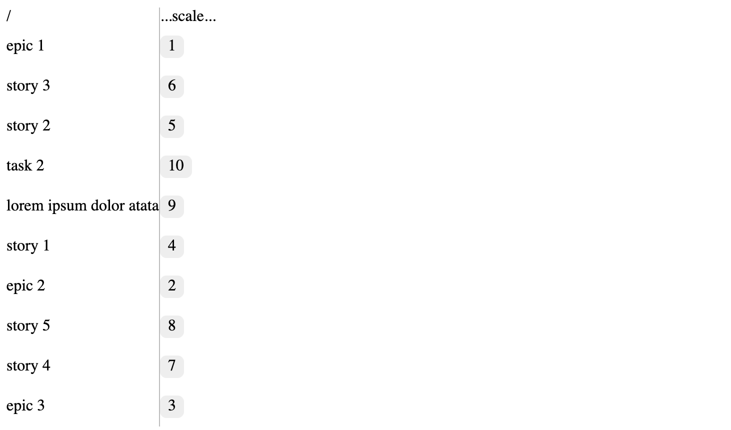
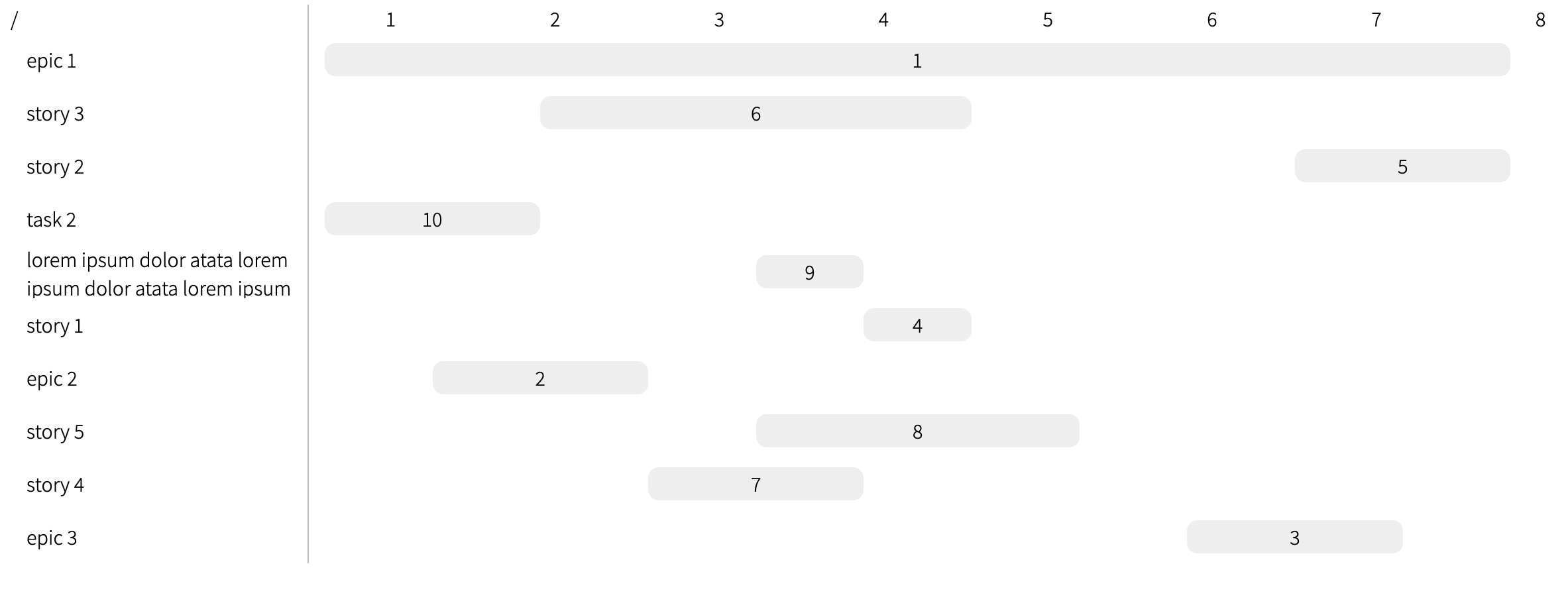
}This requires start and end defined for each entry:
export const data = [
  {
    id: 1,
    name: "epic 1",
    start: 1,
    end: 12,
  },
  {
    id: 2,
    name: "epic 2",
    start: 2,
    end: 4,
  },
  {
    id: 3,
    name: "epic 3",
    start: 9,
    end: 11,
  },
  {
    id: 4,
    name: "story 1",
    parent: 1,
    start: 6,
    end: 7,
  },
  // ...
};
And, to make it not repeat a dozen of inline CSS styles, we can utilize CSS variables:
const RightPaneRow = ({ id, columns, children }) => {
  return (
    <div className={style.row}>
      {children}
    </div>
  );
};

const RightPanelRowEntry = ({ id, start, end, children }) => {
  return (
    <div
      className={style.entry}
      style={{
        "--col-start": start,
        "--col-end": end,
      }}
    >
      {children}
    </div>
  );
};

const RightPane = ({ items, columns }) => {
  const columnHeaders = [...Array(columns)].map((_, idx) => (
    <RightPaneHeader>{idx + 1}</RightPaneHeader>
  ));

  const rows = items.map((item) => (
    <RightPaneRow key={item.id} columns={columns}>
      <RightPanelRowEntry {...item}>{item.id}</RightPanelRowEntry>
    </RightPaneRow>
  ));

  return (
    <div className={style.right_pane} style={{ "--columns": columns }}>
      <RightPaneHeaderRow>{columnHeaders}</RightPaneHeaderRow>
      <div className={style.right_pane_rows}>{rows}</div>
    </div>
  );
};
We can also re-use the same row for header:
const RightPaneHeaderRow = ({ children }) => {
  return <div className={style.right_pane_header_row}>{children}</div>;
};
And corresponding CSS:
.gantt .right_pane .right_pane_header_row {
  display: grid;
  grid-area: scale;

  grid-template: auto / repeat(var(--columns, 1), 1fr);
}

.gantt .right_pane .row {
  position: relative;

  grid-template: auto / repeat(var(--columns, 1), 1fr);
}

.gantt .right_pane .row .entry {
  background: #eeeeee;
  padding: 0.1rem 0.5rem;
  border-radius: 0.5rem;
  align-items: center;
  text-align: center;

  grid-area: 1 / var(--col-start, 1) / 1 / var(--col-end, 1);
}
I like to also change the fonts, since the default sans-serif just looks terrible:
@import url("https://fonts.googleapis.com/css2?family=Assistant:wght@200..800&display=swap");

:root {
  font-family: "Assistant", sans-serif;
  font-optical-sizing: auto;
  font-weight: 300;
  font-style: normal;
  font-variation-settings: "wdth" 100;
}
And maybe add some grid lines for the rows:
.gantt .row:first-child {
  border-top: 1px solid var(--border-color, #eee);
}

.gantt .row {
  padding: 0 0.75rem;
  border-bottom: 1px solid var(--border-color, #eee);
}
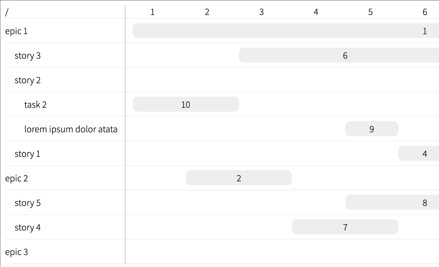
Now let’s add some padding to separate parent and child items of a chart:
const LeftPaneRow = ({ level, id, name }) => {
  const nestingPadding = `${level}rem`;

  return (
    <div className={style.row} style={{ "--label-padding": nestingPadding }}>
      {name}
    </div>
  );
};.gantt .left_pane .row {
padding-left: var(--label-padding, 0);
}and fill out the level property when flattening the item tree:
export const flattenTree = (items) => {
  const queue = [];

  items
    .filter(({ parent }) => !parent)
    .forEach((item) => queue.push({ level: 0, item }));

  const result = [];
  const visited = new Set();

  while (queue.length > 0) {
    const { level, item } = queue.shift();

    if (visited.has(item.id)) {
      continue;
    }

    result.push({ ...item, level });
    visited.add(item.id);

    items
      .filter((child) => child.parent === item.id)
      .forEach((child) => queue.unshift({ item: child, level: level + 1 }));
  }

  return result;
};
And automate the number of columns calculation:
export const Gantt = ({ items }) => {
  const itemList = flattenTree(items);

  const startsAndEnds = items.flatMap(({ start, end }) => [start, end]);
  const columns = Math.max(...startsAndEnds) - Math.min(...startsAndEnds);

  return (
    <div className={style.gantt}>
      <LeftPane items={itemList} />
      <RightPane items={itemList} columns={columns} />
    </div>
  );
};
In order to make chart panel scrollable, one can set a width CSS property for the .right_pane_rows and .right_pane_header_row:
.gantt .right_pane .right_pane_rows {
width: 2000px;
}
.gantt .right_pane .right_pane_header_row {
width: 2000px;
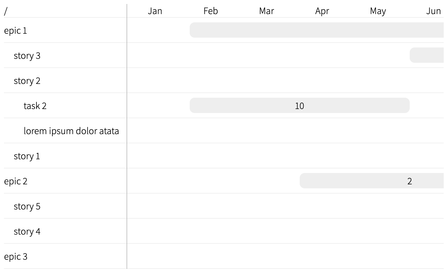
}The last bit for a this prototype would be to have a scale for the columns.
Assume a chart item has an abstract start and end fields - these could be dates or some domain-specific numbers (like a week in a quarter or a sprint, etc.).
Those will then need to be mapped onto column index. Then the chart width (in columns) would be the difference between the smallest start value and the biggest end value:
export const Gantt = ({ items, scale }) => {
  const itemList = flattenTree(items).map((item) => ({
    ...item,
    ...scale(item), // assuming `scale` function returns an object { start: number; end: number }
  }));

  const minStartItem = minBy(itemList, (item) => item.start);
  const maxEndItem = maxBy(itemList, (item) => item.end);

  const columns = maxEndItem.end - minStartItem.start;

  return (
    <div className={style.gantt}>
      <LeftPane items={itemList} />
      <RightPane items={itemList} columns={columns} />
    </div>
  );
};
The minBy and maxBy helper functions could be either taken from lodash or manually defined like this:
const minBy = (items, selector) => {
  if (items.length === 0) {
    return undefined;
  }

  let minIndex = 0;

  items.forEach((item, index) => {
    if (selector(item) < selector(items[minIndex])) {
      minIndex = index;
    }
  });

  return items[minIndex];
}
For better navigation around this code we can add some types:
interface GanttChartItem {
  id: string;
  name: string;
}

interface GanttChartProps {
  items: GanttChartItem[];
  scale: (item: GanttChartItem) => { start: number; end: number };
}

function minBy<T>(items: T[], selector: (item: T) => number): T | undefined {
  // ...
}

export const Gantt = ({ items, scale }: GanttChartProps) => {
  // ...
};

export default function App() {
  const scale = ({ start, end }) => {
    return { start: start * 2, end: end * 2 };
  };

  return <Gantt items={data} scale={scale} />;
}
We can extend this even further by adding an API to provide labels for columns:
interface GanttChartProps {
// ...
scaleLabel: (column: number) => React.Element;
}
export const Gantt = ({ items, scale, scaleLabel }: GanttChartProps) => {
// ...
return (
<div className={style.gantt}>
<LeftPane items={itemList} />
<RightPane items={itemList} columns={columns} scaleLabel={scaleLabel} />
</div>
);
};
const RightPane = ({ items, columns, scaleLabel }) => {
const columnHeaders = [...Array(columns)].map((_, idx) => (
<RightPaneHeader>{scaleLabel(idx)}</RightPaneHeader>
));
// ...
};
export default function App() {
const scale = ({ start, end }) => ({ start, end });
};
const scaleLabel = (col) => `${col}`;
return <Gantt items={data} scale={scale} scaleLabel={scaleLabel} />;
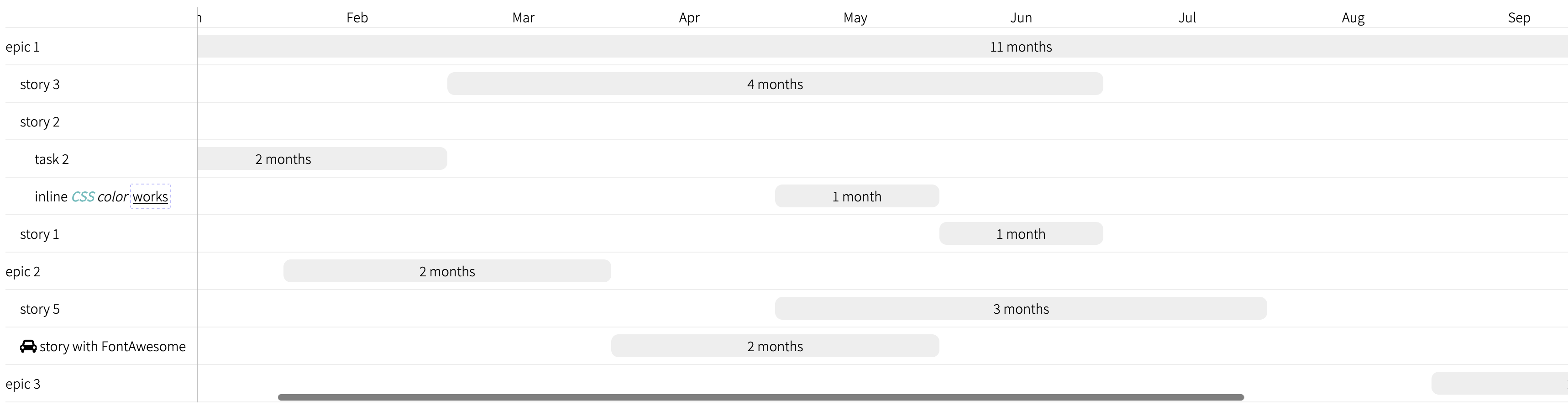
}This new API can then be utilized to show month names, for instance:
export default function App() {
  const scale = ({ start, end }) => {
    return { start, end };
  };

  const months = [
    "Jan",
    "Feb",
    "Mar",
    "Apr",
    "May",
    "Jun",
    "Jul",
    "Aug",
    "Sep",
    "Oct",
    "Nov",
    "Dec",
  ];

  const scaleLabel = (col) => months[col % 12];

  return <Gantt items={data} scale={scale} scaleLabel={scaleLabel} />;
}
Moreover, it is now possible to inline HTML and CSS in the name of each chart item:
export const LeftPaneRow = ({ level, name }) => {
  const nestingPadding = `${level}rem`;

  return (
    <div className={style.row} style={{ "--label-padding": nestingPadding }}>
      <span dangerouslySetInnerHTML={{__html: name}}></span>
    </div>
  );
};
And then in data.json (note that FontAwesome requires its CSS on a page in order to work):
[
{
id: 7,
name: '<i style="font-family: \'FontAwesome\';" class="fa fa-car"></i> story with FontAwesome',
parent: 2,
start: 4,
end: 6,
},
{
id: 9,
name: 'inline <em><b style="color: #5ebebe">CSS</b> color</em> <u style="border: 1px dashed #bebefe; padding: 2px; border-radius: 2px">works</u>',
parent: 5,
start: 5,
end: 6,
},
]The API can be further improved by providing the render function for the bars’ labels:
export const RightPane = ({ items, columns, scaleLabel, barLabel }) => {
  const rows = items.map((item) => (
    <RightPaneRow key={item.id} columns={columns}>
      <RightPaneRowEntry {...item}>{barLabel ? barLabel(item) : <>{item.id}</>}</RightPaneRowEntry>
    </RightPaneRow>
  ));

  // ...
};

export interface GanttChartProps {
  items: GanttChartItem[];
  scale: (item: GanttChartItem) => { start: number; end: number };
  scaleLabel: (column: number) => React.Element;
  barLabel: (item: GanttChartItem) => React.Element;
}

export const Chart = ({
  items,
  barLabel,
  scale,
  scaleLabel,
}: GanttChartProps) => {
  // ...
  return (
    <div className={style.gantt}>
      <LeftPane items={itemList} />
      <RightPane
        items={itemList}
        columns={columns}
        scaleLabel={scaleLabel}
        barLabel={barLabel}
      />
    </div>
  );
};
and then in App component:
import pluralize from "pluralize";

export default function App() {
  const barLabel = ({ start, end }) => (
    <>
      {end - start} {pluralize("month", end - start)}
    </>
  );

  // ...

  return (
    <Chart
      items={data}
      scale={scale}
      scaleLabel={scaleLabel}
      barLabel={barLabel}
    />
  );
};