About Bower, WebComponents and the all the good

BEM
These days, many web developers use different methodologies to make their web page source look structured and clean. But all those methodologies only work well until you use third-party libraries or involve a new person in your project.
BEM (Block Element Modifier) is a convention for naming CSS classes in a such way so they do not overlap.
Doing so you may turn your page into a set of independent blocks, or components. According to BEM,
you name your CSS classes as follows: BlockName__ElementName__ElementModifier.
BlockName is a name of a component, your element belongs to. This may be a menu, a gallery or a widget,
for example.
ElementName is a name of element of the block. Good examples of elements are label, title, avatar, menu_item,
etc.
ElementModifier is a more complex thing. This is a state of element, which defines how element may look
like in a certain conditions. This may be a checkbox’ checked status, focus property or is_menu_opened
flag. Modifier may have one of two types:
boolean, where modifier is just a flag, showing if element’s property is active or notkey-value, where modifier points to one of many possible property values
For example, boolean modifiers are: checked, big (is element big or not), hovered, opened, etc.
Key-value modifiers may be, for instance, menu_type_bullet or menu_type_numbers, menu_top, menu_left
or menu_right (representing menu’ position).
Combining those three you may determine the look of any element and its state:
.navigation__menu__position_left {...}
.navigation__menu__position_right { ... }

.top_menu__avatar__small { ... }
.top_menu__avatar__medium { ... }

/* more meaningful */
.user_widget__avatar__menu_position_top { ... }
.user_widget__avatar__menu_position_left { ... }
.user_widget__avatar__menu_position_right { ... }

/* more simple */
.button__big { ... }
.button__red { ... }
The aim of BEM is great - to make the web page use independent blocks with some structured CSS class names and have them all described in a nice way in the CSS files. Whilst it may sound like a Holy Grail for the Web, let’s take a look at a real-world example of how BEM is used.
There are, in fact, two approaches of BEM.
The old approach
Below is an example of vanilla BEM:
.bwelcome__message.hidden {
    display: none;
}

.bwelcome__message {
    color: yellow;
    border-radius: 5px;
    text-align: center;
}

.bwelcome__label {
    font-size: 12pt;
}

.bwelcome__input {
    display: block;
    width: 100%;
}
And the HTML:
<div class="bwelcome">
<div class="bwelcome__message hiddent">Hello, username!</div>
<div class="bwelcome__label">Enter your name:</div>
<div class="bwelcome__input"></div>
</div>
So, here we can see that any styles should not overlap with the defined ones unless they are written in a BEM-way for the same element. Nice idea,implementation not so nice… All these b#{block}__#{element} classes are way too long, don’t you think? Writing them everywhere - HTML, CSS and JavaScript - is really painful.
The new approach
But what about the newer version of BEM? Its authors developed a toolbox with their own framework, containing many tools to help you use BEM methodology. It contains two interesting tools - BEMJSON and BEMHTML. Those two allow you to define your views with JavaScript and JSON.
To use them, just install bem with npm: npm install bem. Then you will be able to create your pages
with either BEM, BEMTREE, BEMHTML and BEMJSON. This has two advantages to writing pages by your own:
- they come with plugins, so you may have some parts of CSS ready to use out-of-the-box
- it replaces writing all the selectors manually with writing them via commands of the
bemutility
For instance, here’s how your page may look like when being made with BEMHTML:
({
     block: 'page',
     title: 'hello',
     head: [
         { elem: 'css', url: '_hello.css' }
     ],
     scripts: [{ elem: 'js', url: '_hello.js' }],
     mods: { theme: 'islands' },
     content: [
         {
             block: 'hello',
             content: [
                 {
                     elem: 'greeting',
                     content: 'Hello, %username%!'
                  }
             ]
         }
     ]
 })
And here’s how it may look like when made with BEMJSON:
exports.deps = [
    {
        "block": "page",
        "elem": "css",
        "attrs": { "src": "_hello.css" }
    },
    {
        "block": "page",
        "elem": "js",
        "attrs": { "src": "_hello.js" }
    },
    {
        "block": "page",
        "elem": "meta"
    },
    {
        "block": "header"
    },
    {
        "block": "content"
    },
    {
        "block": "footer"
    }
];
Those two may work both together, when you define general page structure with BEMJSON and each block you define with BEMHTML, or separatedly, when you define all your page in either BEMJSON or BEMHTML.
But anyway, in BEMJSON or BEMHTML or whatever, the whole page is described in one JS file, which will then be compiled into an HTML page. Using this approach allows you not only to pack the blocks and elements into one structure, but also to spice it up with some JavaScript, which handles those components.
Sounds great and may be somewhat helpful for new projects. But I believe there’s a better solution.
Introducing WebComponents
Although the implementation of BEM is clumsy, the idea is really great! This is just like encapsulation in OOP - one of the mightiest principles in programming. But what better options are there than BEM?
Recently we have all seen great changes to the Web. We now have ES6, CSS3, HTML5 and all of them give us ultimate power! Support for old browsers is now provided with hacks called polyfills. But why should we stop ourselves using the best of what we have in the name of 3% of Internet users? Well, if you really do have to continue supporting all of those, you could just stop reading now. Or you could concentrate all your will and try out all these brand-new features in your pet project.
So, the new approach in web design encapsulation uses WebComponents. This is a technology, which does not works everywhere. This is contraversary to a BEM methodology, where you only define a CSS classes, which are supported since very early CSS versions.
So, welcome the WebComponents’ example:
<template id="welcome-component">
<style>
.message {
background-color: #fea;
padding: 10px 20px;
text-align: left;
border-radius: 5px;
font-family: Arial;
}
</style>
<div class="message">Hello, !</div>
</template>
<div class="shadow-host"></div>
<div class="message">Non-component message</div>
<script type="text/javascript">
var host = document.querySelector('.shadow-host'),
template = document.querySelector('#welcome-component'),
shadow = host.createShadowRoot();
shadow.appendChild(template.content);
</script>
This code may not look so good, as it might, but it works like a charm!
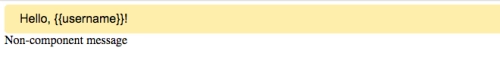
This example is a bit ugly - it has both CSS, HTML and JavaScript mixed in a single file, but we’ll deal with it for a short time. Just think of the power you’ve got! You can define your own… well, it’s certainly kinda components! It is a bit uncomfortable to paste onto a page… and they are hardly ready to be used with something like Angular.
Well, yeah, this is as ugly as BEM.
But now you defined a component of your web-page, which you can then reuse with copying just one portion of XHTML in place. And placing it inside a totally different web page will not break it down - both HTML and CSS are separated and isolated and will not overlap with any other style or martkup. But let’s try out our web component!
Bower
Earlier I did not need to use any package managers except gem and apt-get. Yet, I was not so stupid as to install all the javascript libraries my project needs with RubyGems. On my projects I had to download the necessary library versions and store them in the assets/javascripts directory. Forever. Or at the very least an upgrade was needed.
But then I tried Bower. It was so easy to manage my assets! So I highly recommend this way to you, dear Reader!
To use Bower from scratch on a brand new project, you need to
- install Bower with
npm - ininitialize your project with
bower init - define dependencies in the
dependenciesobject in your newbower.jsonfile - install them with
bower install
Then you should end up with all your libraries in the bower_components directory. And that’s it! Every package has its own dir. So you can keep track of all the versions etc.
Polymer
Let’s start cooking our demo with Polymer. First, initialize the Bower project and add this section to your fresh bower.json file:
"dependencies": {
    "polymer": "Polymer/polymer#^1.0.0"
}
Then run bower install. This will provide you with all the stuff you need.
Now we will move our pretty welcome-component to a new place. Create two files:welcome-component.html and index.html. Fill the last one with Emmet:
html:5
(you need to hit the “Expand” key, formerly Tab, at the end of this single line while editing theindex.html file in an Emmet-powered editor). And add just a single line within the HTML’ <body> tag:
<welcome-component></welcome-component>
Now let’s define our new component in welcome-component.html:
<dom-module id="welcome-component">
<style>
.message {
background-color: #fea;
padding: 10px 20px;
text-align: left;
border-radius: 5px;
font-family: Arial;
}
</style>
<template>
<div class="message">Hello, !</div>
</template>
<script>
Polymer({
is: "welcome-component"
});
</script>
</dom-module>
Now, add our new component importing to the <head> tag of the index.html file:
<link rel="import" href="bower_components/polymer/polymer.html" /> <!-- imports Polymer -->
<link rel="import" href="welcome-component.html" /> <!-- imports our component -->
To run this quickly, you might want to use http-server from npm:
http-server -o --cors
And voila! We’ve just made a nice web component, which could be used really simply. And the code is totally clean!
If you look at the HTML source, you’d see a beautiful DOM structure: we’ve got our <div class="message"> within the <welcome-component> tag. And its style will never affect any other elements, even when you create another <div> outside the <welcome-component>. Seriously, you can try it!
Yeah, I know we’ve used Polymer and that’s cheating. But think of it as of a temporary hack you will remove when your browser starts supporting custom tags.
Custom attributes for custom tags
Now, the last thing I’d like to show is the attributes for our custom components. We’d like to pass some data to our brand new components easily, right? So, let’s define a name attribute, which we’ll show instead of it!
To do this, we shall use two Polymer features. First of all, let’s define our attribute, adding this section to our Polymer() call:
Polymer({
    ...
    properties: {
      name: {
        type: String
      }
    }
    ...
});
Now that we’ve defined our attribute THAT simply, we should use it somehow. Polymer allows us to define a method, which will be called once the component gets inserted into a webpage:
Polymer({
    ...
    ready: function() {
      this.querySelector('.message').innerHTML = `Hello, ${this.name}!`
    }
    ...
});
As long as you’re riding IOJS NodeJS 5.0+, you can use the ES6 string interpolation feature, as in the example above =) Here, the this variable is bound to the <welcome-component> tag. So in order to change the .message tag’s HTML, we need to find it first. For this purpose I’ve used the HTML5 querySelector method.
Cool enough, right?
Conclusion goes here
To end-up this short tutorial on WebComponents, I would like to suggest you to read some other tutorials, especially the WebComponents website. And never stop trying something new!